
This past June, my partner Vero Ramak and me, were invited to give a presentation on the Caracas Design Week about our experience in the design and illustration industry.
We ended up making a presentation about the ways that design and illustration can come together to make powerful and remarkable brand identities. But we didn’t just want to give a speech, we also wanted to give a great example of this. So with just a couple of days in our hands to create something special, we started working asap!
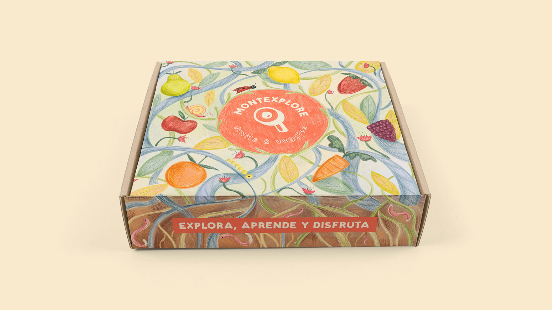
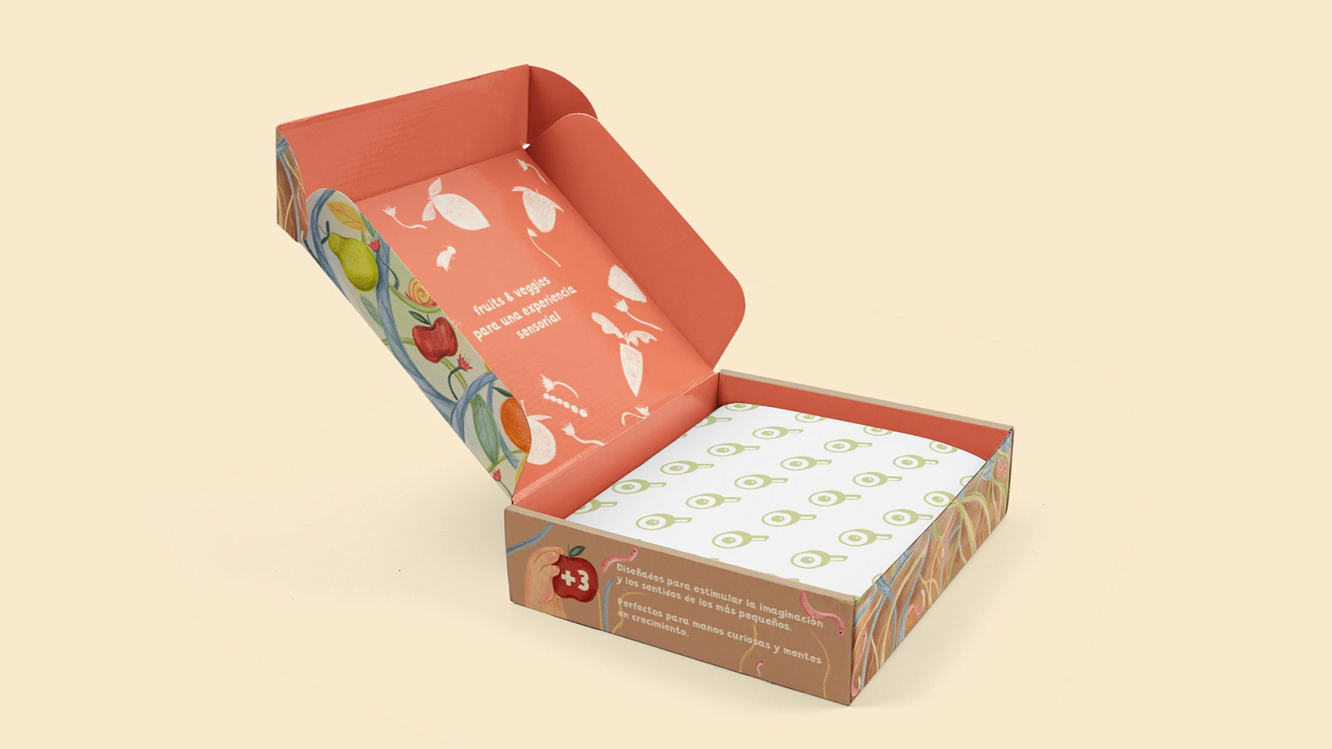
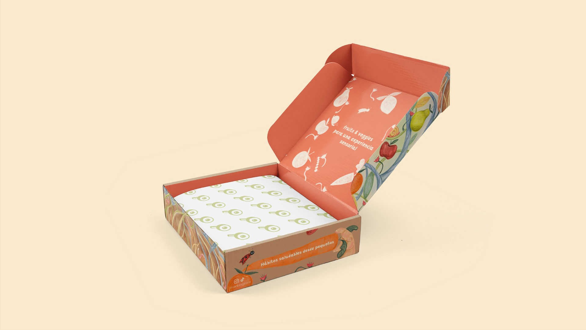
That’s how we came up with Montexplore: a brand of fruit and vegetables Montessori toys, full of bright colors and a very childish look to it so it would capture the attention of both parents and kids.
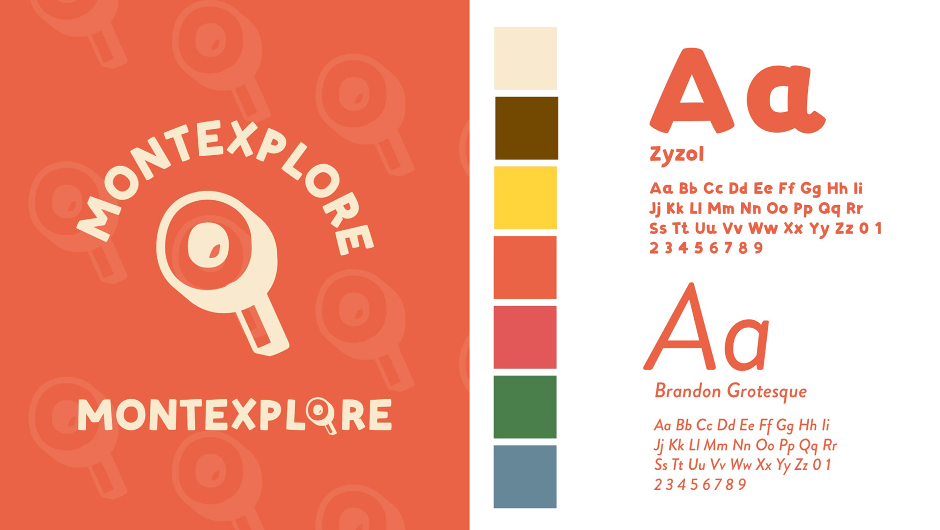
Brand’s typography, logo and main colors
Having these guidelines, I started working on the illustration. We wanted a big illustration, full of colors and details and that would represent the brand’s organic nature.
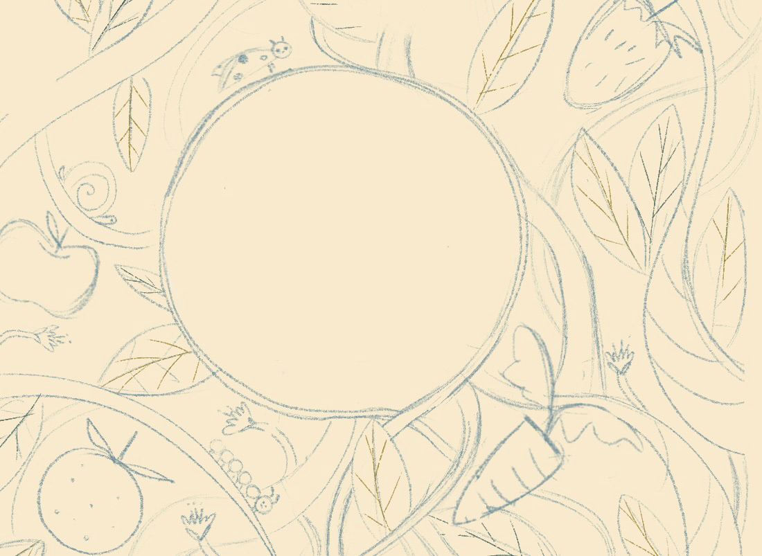
A bit of the initial sketch
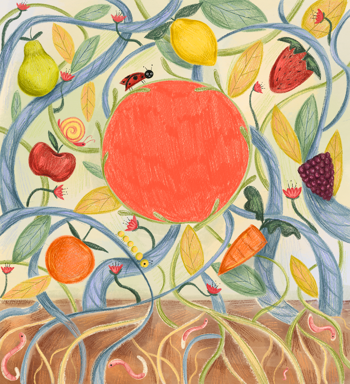
So we ended up with this:
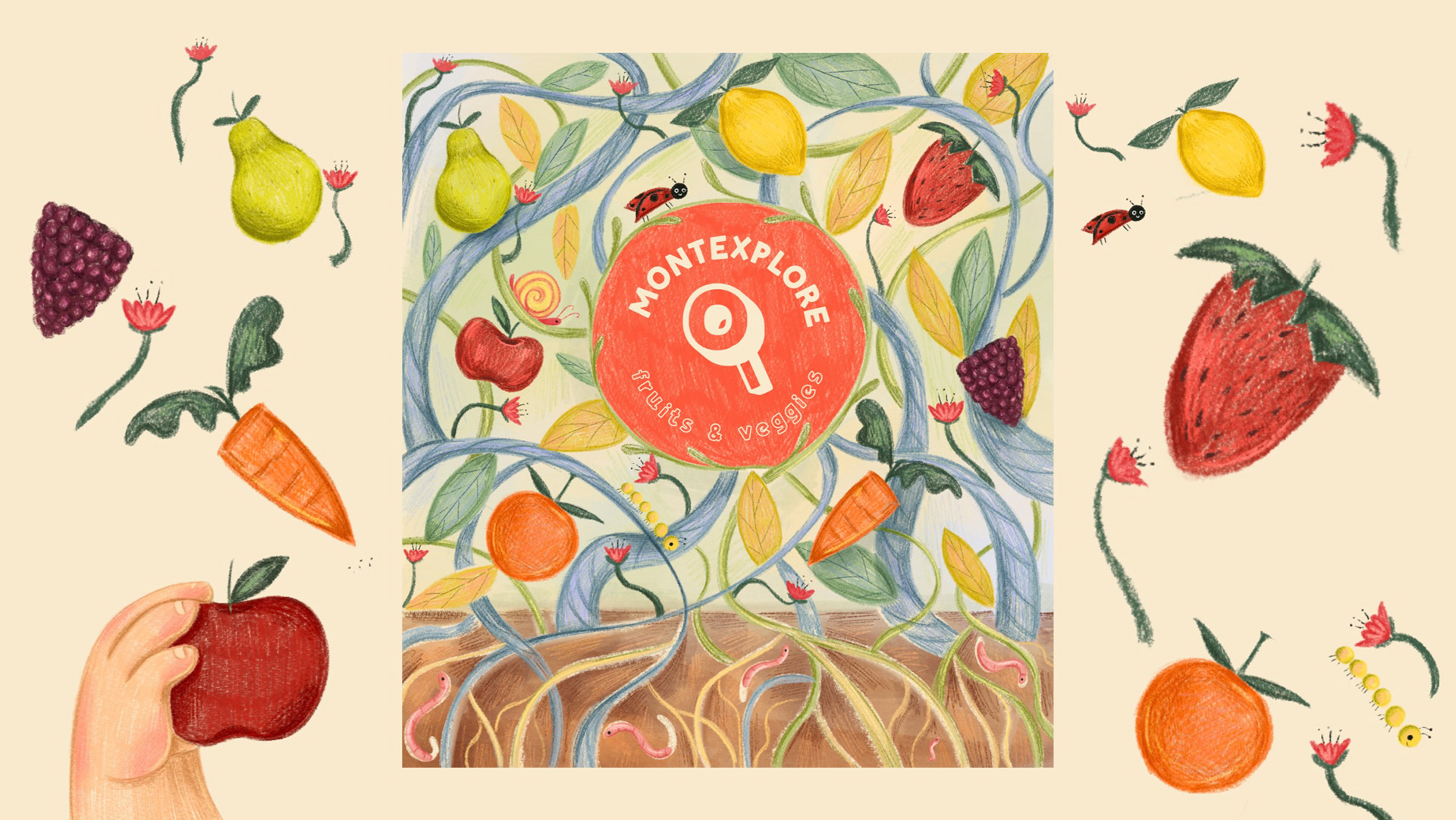
After we had the illustration, Vero did her design magic, adding the illustration to a mockup so people would see the final result. This was the final look:
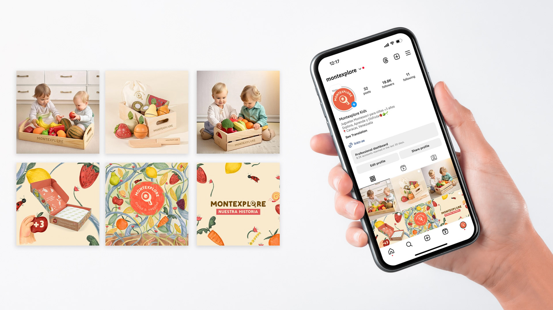
And for the cherry on top, Vero also made an example of how the Brand’s social media would look like!
At the end, everybody loved the presentation and went home having an idea of the power design an illustration can have on a brand’s identity. Hope you liked it too!